
NEW RICH-TEXT EDITOR TOOLBAR (RTE)
The following document will take you through the new toolbar and specifically how each icon functions. Many of the icons are similar to the previous toolbar, but have additional new features.
 Styles Dropdown
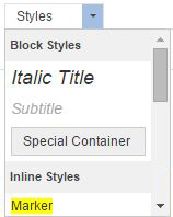
The Styles dropdown allows you to use predefined formatting to stylize your text. To use, select your text, click on the Styles dropdown, and select the appropriate style.
Format Dropdown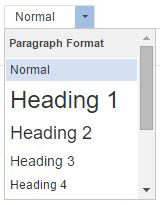
The Format dropdown allows you to use predefined formatting to stylize the paragraph format. This allows you to keep the text size throughout your site uniform. To use, select your text, click on the format drop down, and select the appropriate style.
Font Dropdown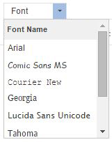
The font dropdown allows you to change the font used for your text. To change the text, highlight your text, select the font dropdown, and click on the appropriate font. By default, the font will be Verdana.
Font Size Dropdown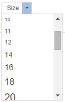
The font size dropdown allows you to change the font size used for your text. To change the text, highlight your text, select the size dropdown, and click on the appropriate font size. By default, the font size will be 14.
Bold The B icon allows you to bold your text. To use, highlight your text and select the bold icon.
Italic  The I icon allows you to Italicize your text. To use, highlight your text and select the italicize icon.
Underline The U icon allows you to underline your text. To use, highlight your text and select the underline icon.
Strikethrough The strikethrough icon allows you to strike the text through (horizontal line through text). To use, highlight your text and select the strikethrough icon.
Subscript and Superscript
 The subscript and superscript icons allow you to add your text as a subscript (slightly smaller and set below surrounding text) or superscript (slightly smaller and set above surrounding text). To use, highlight your text and select the subscript or superscript icon.
Remove Formatting The Remove Formatting icon will strip all text formatting, leaving you with just text. To use, highlight the text and select the remove formatting icon.
Text Color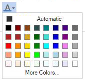
The text color icon allows you to change the color of your text. To use, highlight your text and select one of the predefined colors. For more color options, select More Colors.
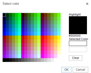
Once More Colors is selected, you can select a color or enter a hex code (hex code must start with #).
Background Color 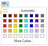
The background color icon allows you to change the text background color. To use, highlight your text, select background color icon, and select a color. You can select more colors for more color options.
Numbered List The number list icon allows you to create an organized list using numbers. To create a numbered list, click on the numbered list icon and type your text, selecting enter on your keyboard for the next number. You can also highlight text that is already on your page and click on the numbered list icon.
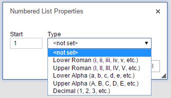 Once you have your numbered list, you can right click within your list to change the numbered list properties. The properties will allow you to change the start number and the list type.Each layer of a list can use a different list type so you can use both numbers and letters for example.
Bulleted List The bulleted list icon allows you to create an organized list using shapes as the marker instead of numbers. To create a bulleted list, click on the bulleted list icon and type your text, selecting enter on your keyboard for the next line. You can also highlight text that is already on your page and click on the bulleted list icon.
 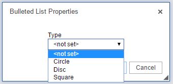 Once you have your bulleted list, you can right click within your list to change the bulleted list properties. The properties will allow you to change the shape of the bullets.
Decrease and Increase IndentTh  e increase indent icon allows you to indent your text on the page. The decrease indent icon will move your text to the left one tab length. To use, highlight your text and select the icon. You can also place your cursor before or after your text and select the icon.
Block Quote The block quote icon allows you to distinguish a piece of text by having it indented from the left and right. To use, highlight your text and select the block quote icon or select the block quote icon and enter text.
Alignment The alignment icons (left, center, right, and justified) allow you to change the placement of the text. To use, highlight your text and select the appropriate alignment icon.
Source The source icon allows you to see the HTML of your page. The source icon replaces the HTML tab that was previously at the bottom of a page.
Templates Similar to the templates drop down in the old toolbar, the templates icon allows you to use a predefined page structure for creating content. To use, select the templates icon, click on the template to use, and begin entering your text.
Cut The cut icon allows you to remove text from the page. To use, highlight the text and select the cut icon. You can also highlight the text, right click, and select cut.
Copy The copy icon allows you to copy a piece of text. To use, highlight the text and select the copy icon. You can also highlight the text, right click, and select copy.
Paste The paste icon allows you to paste text from an outside source onto the page. To use, place your cursor where you would like the text to display and select the paste icon. Depending on your security settings, you may need to paste the text into the paste window first. You can also right click on the page and select paste.
Paste as Code The paste as code icon replaces the insert media icon from the old toolbar and allows you to enter embed code on your page (from YouTube, SchoolTube, Voki, etc.). To use, place your cursor where you would like your widget/video/etc. to display, select the paste as code icon, enter the code, and click ok.
Paste as Plain Text The paste as plain text icon will allow you to paste in text without preserving any formatting. To use, place your cursor where you would like the text to display, click on the paste as plain text icon, paste the text in, and click on ok.
Paste from Word The paste from word icon will allow you to paste text from Word and keep basic formatting. To use, place your cursor where you would like the text to display, click on the paste from word icon, paste in the text, and click ok.
Undo The undo icon allows you to remove the last change on the page.
Redo The redo icon allows you to add the change back to the page that was previously removed with the undo icon.
Find The find icon allows you to locate a specific word or phrase within the page.
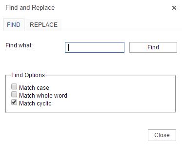 Match case: Allows the search to be case sensitive (uppercase and lowercase will matter).
Match whole word: Will only find the entire word. For example, if searching for test the results will not include the word testing.
Match cyclic: Will allow the search to go through the entire page and not stop at the bottom of the page.
Replace The replace icon allows you to search for a word and replace it with another word.
 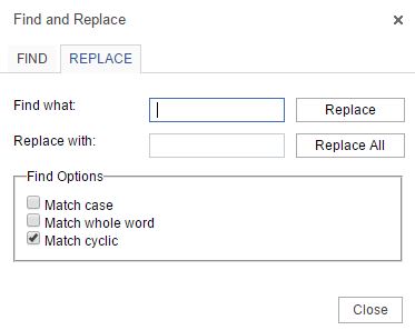 To use, enter the word to find in the find what field and enter the word to replace it with in the Replace with field. Select Replace or Replace all.
Select All The select all icon selects all of the content on a page, allowing you to change all of the font, size, etc.
Hyperlink The hyperlink icon allows you to add a link to a piece of text. To use, highlight the text you would like to link and click on the hyperlink icon.
 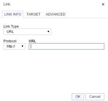 Select the link type:URL: creates a link to a web address
Link to anchor in the text: creates a link to an anchor you have previously created on the page.
Email: creates a link to an email address.
Protocol: this allows you to change the beginning portion of the link, for example http:// or https://
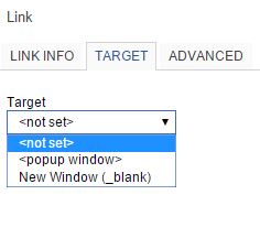 The target tab allows you to determine how the link opens.
Not Set: link opens in the same browser window or tab.
Popup Window: link opens in a popup window that overlays the page. If you select Popup Window you can set parameters for the window.
New Window: link opens in a new tab.
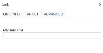 The advanced tab allows you to enter the link title, which will display when users hover over the link.
Remove Hyperlink The unlink icon removes a hyperlink. To use, highlight the hyperlink and click on the unlink icon.
Anchor  The anchor icon allows you to put a marker within your text that you can link to.
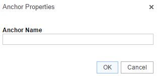 To add an anchor, place your cursor where you would like to add the anchor. Click on the anchor icon and enter the anchor name. An icon will be added to your page (only visible in the admin area).
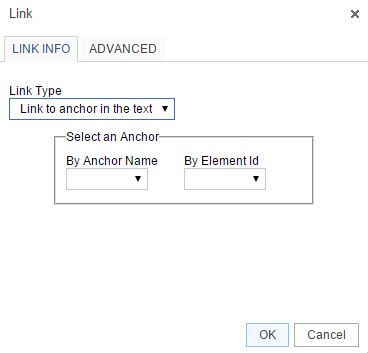 To link to an anchor, highlight the text you would like to link and select the hyperlink icon. Change the Link Type drop down to Link to anchor in the text and select the correct anchor from the anchor name drop down.
To remove an anchor, right click on the anchor icon within your text and select remove anchor.
Image Gallery The image gallery allows you to add images directly to your page. To add, place your cursor where you would like the image to display and click on the Image Gallery icon.
Embed PDF The embed PDF icon allows you to add a PDF directly to your page so visitors can see the PDF on the page without having to click to open a file. To use, place your cursor where you would like the PDF to display, click on the embed PDF icon, paste in the PDF URL (upload to the Filing Cabinet first), update the height, and click on OK.
Insert Table The table icon allows you to add a table to your page. To use, place your cursor where you would like the table to display and click on the table icon. Enter the number of rows and columns. Instead of the additional icons for table editing, you can now right click on the table for table properties.
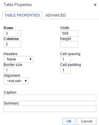 Rows – number of rows in the tableColumns – number of columns in the table Headers – Can apply header formatting (centered and bold to specific rows Border Size – thickness of table borders, 0 will remove lines Alignment – changes the alignment of the table on the page Width – changes the width of the table Height – changes the height of the table Cell Spacing – changes the space between individual cells Cell padding – changes the space between the cell border and the contents Caption – title of table, displays above the table
Summary – provides screen readers with a summary of the table
Cell OptionsTo retrieve this menu, right click within a table cell and hover over Cell.
Insert Cell Before – adds a new cell before the cell you have selected 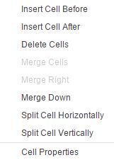 Insert Cell After – adds a new cell after the cell you have selectedDelete Cells – deletes the cell you have selected Merge Cells – merges the cells you have selected into one cell Merge Right – merges the cell you have selected with the cell to the right Merge Down – merges the cell you have selected with the cell below Split Cell Horizontally – splits the cell you have selected in two, adding a cell to the right Split Cell Vertically – splits the cell you have selected in two, adding a cell below Cell Properties – Opens Cell Properties window
Cell Properties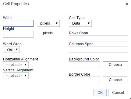 Width – changes the width of the cellHeight – changes the height of the cell Cell Type – changes a cell from a header to a normal data cell Word Wrap – turns word wrap on for the cell Rows Span – changes the number of rows the cell covers. Enter number of rows the cell should stretch over. Columns Span – changes the number of columns the cell covers. Enter number of column the cell should stretch to. Horizontal Alignment – changes alignment for cell Vertical Alignment – change the vertical alignment for cell Background Color – changes the color of cell background Border Color – changes the color of the cell border
Table Row OptionsTo retrieve this menu, right click within your table and hover over Row.
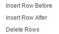 Insert Row Before – adds a new row above the row you have selectedInsert Row After – adds a new row below the row you have selected Delete Rows – removes the row(s) you have selected
Table Column OptionsTo retrieve this menu, right click within your table and hover over Column.
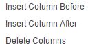 Insert Column Before – adds a new column to the left of your selected columnInserts Column After – adds a new column to the right of your selected column Delete Columns – removes the column(s) you have selected
Insert Horizontal Line The horizontal line icon allows you to enter a horizontal line to your page, spanning from one side of the page to the other. To use, place your cursor where you would like the line to display and select the Horizontal line icon.
Smiley The smiley icon allows you to add emoticons to your page. To use, place your cursor where you would like the emoticon to display, select the smiley icon, and select the graphic to add.
Insert Special Character The insert special character icon allows you to add a character to your page that is not part of your keyboard. To use, place your cursor where you would like the character to display, select the insert special character icon, and click on the character to add.
Maximize The Maximize icon allows you to expand the page content area so it takes up your whole screen.