
SITE PARAGRAPHS
With the additional modules (the standard modules like calendar, lunch menu, jobs, news etc.), we give administrators the ability to add text and images at the top and sometimes below the module page. When you click on Site Paragraphs, you'll see gray text under the page name. It gives a brief description as to its purpose. The Page On Site column links to the front end of the module and the goto address. To add or edit a site paragraph: To delete paragraph text: To create a link to a module: Grouping of site paragraphs - groupings of site paragraphs can be created for better organization. Scroll down to the bottom of the page and click on Edit Group Categories. Enter in the group name in the textbox and hit Save.
To edit a video:
Depending on your browser, you may be able to select the embedded video and click on the Insert Media icon to edit the video. In many browsers, you will need to delete the video and re-add using the Insert Media icon.
To delete a video:
Because of the different ways to embed videos and the browser combinations you may be using, please try one of the following methods to delete a video.
There are two different types of pages that can be added:
Adding Text to your Webpages:
Note: You can mass activate or hide a section of subpages. This option will display for sections with 3+ subpages below the Update button. Use the Select All link to change all subpages to Show on Site and use the Deselect All button to change them to Do Not Show on Site.
The system will make a copy of any image you upload off your desktop and add it to the server - that's why it's important to upload files and images via the Browse button and not drag and drop. There are a few different options for adding pictures to a webpage:
1. Images on Page: The Page Photo is a picture that displays alongside the text on the page. There are two options for placing photos on the page. The photo can be lined up on the right-hand side of the webpage or it can be centered in rows below the copy. You can upload one or two at a time or you can click on the Add Zip File link to upload up to 45 images at once.
Add New Images:
Note: If you add 5 or more images to a page, a slideshow feature will appear on the front end once an image is clicked on.
Edit Images:
2. Headline Image is meant for single images that are centered above the title of the page. Good size parameters for headline images: 500 pixels wide by 80 pixels high.
Adding a Headline Image:
Tip: This process is the same as adding an attachment to an email.
3. Clip Art - the system has royalty-free clip art graphics for you to use. The icons will appear in the upper right corner of the webpages. For more flexibility in the placement of the icon, click on the Page Info tab and add the clip art via the Image Gallery.
Add Clip Art:
4. Slideshows - slideshows added via the Slideshow module can be referenced on any typical page.
Attaching a File to a Webpage:
Files can be any type of attachment and cover a variety of formats. (Note: Do not upload executables). Files can be PowerPoint presentations (.ppt) , Adobe Acrobat files (.pdf), Video presentations (.avi), or Music files (.wav or .mid). It can be any type of information that you would like parents and students to find on your website – newsletters, worksheets, permission slips, handbooks, dress code, discipline procedures, classroom policies, song recordings, pictures of student artwork.
Site contributors also have access to any file added to the filing cabinet to reference on their webpage. Each user has the ability to add an unlimited number of files to each webpage they create.
To attach a file:
To attach multiple files at once:
To reference a file on a page:
Files can be referenced on a page from the filing cabinet. When the file is updated in the filing cabinet, the system will also update it where ever it's referenced on a page.
To remove a referenced file from a page, click on the Referenced link, deselect the checkbox and hit Save.
Visitor Uploads - this area allows you to accept files from the public.
Q: I copied and pasted content onto the page and the format is all askew or I've reached the 64,000 per page character limit.
A: If you copy and paste content from Microsoft Word or another program, either paste the content into Notepad first and then into the page text area OR paste into the page text area and click on the Remove Microsoft Word Formatting button (located on the 1st row of the RTE toolbar). This will remove any bad HTML coding that is causing issues with the editor.
Q: I uploaded an image and it's not displaying properly.
A: Check to make sure there are no spaces or symbols (* for example) in the file name. These can sometimes affect the image upload process. For example, a good image file name would be fieldtrip.jpg
You should also make sure that the image is in RGB format (NOT CMYK).
Q: I tried uploading an image to the Image Gallery and am receiving an error message Error - Process Aborting Your file is too big.
A: If you're trying to upload an image directly off of a digital camera, it's probably over the 2.5 MB size limit. Use a photo editor such as Photoshop or Kodak Easyshare to size the image down before trying to upload to the Image Gallery.
Q: I embedded a hyperlink and it's displaying a Page-Not-Found message.
A: If linking to an external page, check to make sure http:// is included at the beginning of the URL. For example, http://www.google.com as opposed to www.google.com
The following document will take you through the new toolbar and specifically how each icon functions. Many of the icons are similar to the previous toolbar, but have additional new features.

 The B icon allows you to bold your text. To use, highlight your text and select the bold icon.
 The I icon allows you to Italicize your text. To use, highlight your text and select the italicize icon.
 The U icon allows you to underline your text. To use, highlight your text and select the underline icon.
 The strikethrough icon allows you to strike the text through (horizontal line through text). To use, highlight your text and select the strikethrough icon.
 The subscript and superscript icons allow you to add your text as a subscript (slightly smaller and set below surrounding text) or superscript (slightly smaller and set above surrounding text). To use, highlight your text and select the subscript or superscript icon.
 The Remove Formatting icon will strip all text formatting, leaving you with just text. To use, highlight the text and select the remove formatting icon.
 The number list icon allows you to create an organized list using numbers. To create a numbered list, click on the numbered list icon and type your text, selecting enter on your keyboard for the next number. You can also highlight text that is already on your page and click on the numbered list icon.
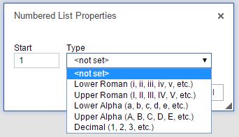 Once you have your numbered list, you can right click within your list to change the numbered list properties. The properties will allow you to change the start number and the list type.
 The bulleted list icon allows you to create an organized list using shapes as the marker instead of numbers. To create a bulleted list, click on the bulleted list icon and type your text, selecting enter on your keyboard for the next line. You can also highlight text that is already on your page and click on the bulleted list icon.
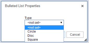 Once you have your bulleted list, you can right click within your list to change the bulleted list properties. The properties will allow you to change the shape of the bullets.
 e increase indent icon allows you to indent your text on the page. The decrease indent icon will move your text to the left one tab length. To use, highlight your text and select the icon. You can also place your cursor before or after your text and select the icon.
 The block quote icon allows you to distinguish a piece of text by having it indented from the left and right. To use, highlight your text and select the block quote icon or select the block quote icon and enter text.
 The alignment icons (left, center, right, and justified) allow you to change the placement of the text. To use, highlight your text and select the appropriate alignment icon.
 The source icon allows you to see the HTML of your page. The source icon replaces the HTML tab that was previously at the bottom of a page.
 Similar to the templates drop down in the old toolbar, the templates icon allows you to use a predefined page structure for creating content. To use, select the templates icon, click on the template to use, and begin entering your text.
 The cut icon allows you to remove text from the page. To use, highlight the text and select the cut icon. You can also highlight the text, right click, and select cut.
 The copy icon allows you to copy a piece of text. To use, highlight the text and select the copy icon. You can also highlight the text, right click, and select copy.
 The paste icon allows you to paste text from an outside source onto the page. To use, place your cursor where you would like the text to display and select the paste icon. Depending on your security settings, you may need to paste the text into the paste window first. You can also right click on the page and select paste.
 The paste as code icon replaces the insert media icon from the old toolbar and allows you to enter embed code on your page (from YouTube, SchoolTube, Voki, etc.). To use, place your cursor where you would like your widget/video/etc. to display, select the paste as code icon, enter the code, and click ok.
 The paste as plain text icon will allow you to paste in text without preserving any formatting. To use, place your cursor where you would like the text to display, click on the paste as plain text icon, paste the text in, and click on ok.
 The paste from word icon will allow you to paste text from Word and keep basic formatting. To use, place your cursor where you would like the text to display, click on the paste from word icon, paste in the text, and click ok.
 The undo icon allows you to remove the last change on the page.
 The redo icon allows you to add the change back to the page that was previously removed with the undo icon.
 The find icon allows you to locate a specific word or phrase within the page.
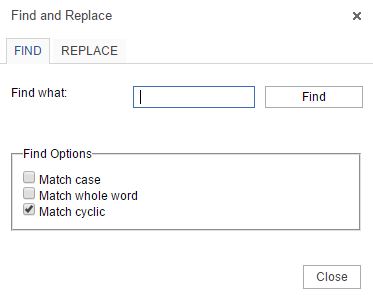 Match case: Allows the search to be case sensitive (uppercase and lowercase will matter).
 The replace icon allows you to search for a word and replace it with another word.
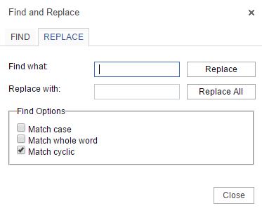 To use, enter the word to find in the find what field and enter the word to replace it with in the Replace with field. Select Replace or Replace all.
 The select all icon selects all of the content on a page, allowing you to change all of the font, size, etc.
 The hyperlink icon allows you to add a link to a piece of text. To use, highlight the text you would like to link and click on the hyperlink icon.
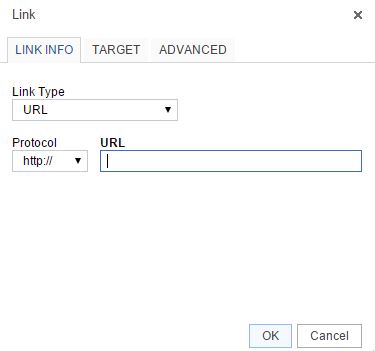 Select the link type:
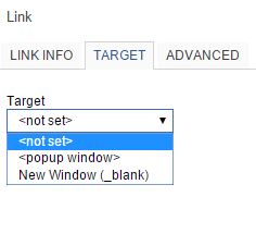 The target tab allows you to determine how the link opens.
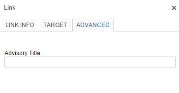 The advanced tab allows you to enter the link title, which will display when users hover over the link.
 The unlink icon removes a hyperlink. To use, highlight the hyperlink and click on the unlink icon.
 The anchor icon allows you to put a marker within your text that you can link to.
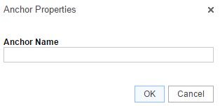 To add an anchor, place your cursor where you would like to add the anchor. Click on the anchor icon and enter the anchor name. An icon will be added to your page (only visible in the admin area).
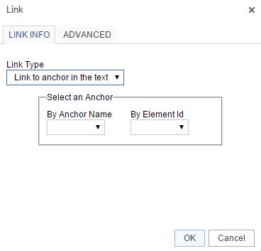 To link to an anchor, highlight the text you would like to link and select the hyperlink icon. Change the Link Type drop down to Link to anchor in the text and select the correct anchor from the anchor name drop down.
 The image gallery allows you to add images directly to your page. To add, place your cursor where you would like the image to display and click on the Image Gallery icon.
 The embed PDF icon allows you to add a PDF directly to your page so visitors can see the PDF on the page without having to click to open a file. To use, place your cursor where you would like the PDF to display, click on the embed PDF icon, paste in the PDF URL (upload to the Filing Cabinet first), update the height, and click on OK.
 The table icon allows you to add a table to your page. To use, place your cursor where you would like the table to display and click on the table icon. Enter the number of rows and columns. Instead of the additional icons for table editing, you can now right click on the table for table properties.
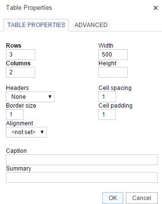 Rows – number of rows in the table
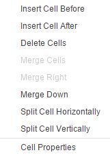 Insert Cell After – adds a new cell after the cell you have selected
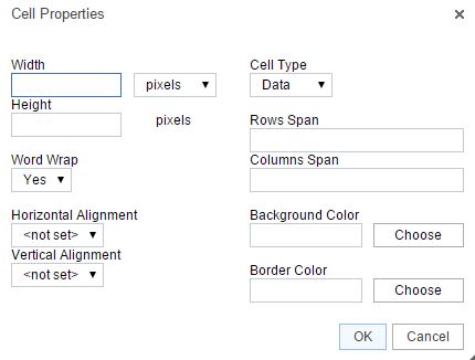 Width – changes the width of the cell
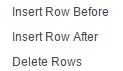 Insert Row Before – adds a new row above the row you have selected
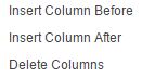 Insert Column Before – adds a new column to the left of your selected column
 The horizontal line icon allows you to enter a horizontal line to your page, spanning from one side of the page to the other. To use, place your cursor where you would like the line to display and select the Horizontal line icon.
 The smiley icon allows you to add emoticons to your page. To use, place your cursor where you would like the emoticon to display, select the smiley icon, and select the graphic to add.
 The insert special character icon allows you to add a character to your page that is not part of your keyboard. To use, place your cursor where you would like the character to display, select the insert special character icon, and click on the character to add.
 The Maximize icon allows you to expand the page content area so it takes up your whole screen.
This product allows you to setup and maintain your own set of 8 main navigational buttons. It's important to give some thought to your main navigation structure as it is one of the first features visitors will see on the homepage and aids with navigation throughout the website.
Once the main navigation buttons are setup, you can proceed with adding as many subpages as you'd like below each section. The Adding Webpages help section reviews adding subpages.
Note- Due to the number of problems we were getting from people using javascript or bad HTML in the navigation and page titles, we encoded all HTML and javascript in those fields. So HTML is no longer allowed in the navigation title.
With the new In-Line Editor, authorized users will always be just a click away from adding content using the same powerful editing experience offered in the administration area. Authorized users will be able to edit rich content right from the front end of the website, allowing users to see how the content will look before it goes live. For more information on the In-Line Editor, please review the Adding Webpages Help Section.
Related Links - This section will list all the existing related links on the district/school sites that were added via the Links tab on a typical page. It will check their status; verifying that the URL is still live and responding. As the links are verified, there will be a status next to each link. If necessary, you will be able to edit the link from the appropriate edit link.
Since each link needs to be verified by accessing the site - this may take up to three minutes to return results. There is a five second timeout period set for each link (if site does not respond within five seconds, the next link is checked).
PUBLIC WEBSITE FEATURES
The public website features video gives an overview of what visitors will see when viewing the website. Website RSS is available (newinfo.cfm) and pulls in pages, news, calendar, filing cabinet and job posting updates. The updates only show if they will be happening within the next 30 days. Also, updates are pulled to the newinfo.cfm page every six hours. That would be around 6 am, noon, 6 pm and midnight. If a site admin makes an update at 8 am, it will not appear until noon. Contact support to activate.